Reform’s Richard Tice says ‘we’re sick of it’ as Government spends £532k on ‘moving a dot’

Richard Tice took to X to voice his displeasure (Image: GETTY)
Richard Tice has launched a scathing attack on the Government as a fresh row erupts over £532,000 spent on minor tweaks to the GOV.UK website logo. The Reform UK deputy leader took to X on Monday to blast the expenditure, reposting a viral message from a UK-based entrepreneur lamenting what he called the “squandering” of taxpayers’ cash.
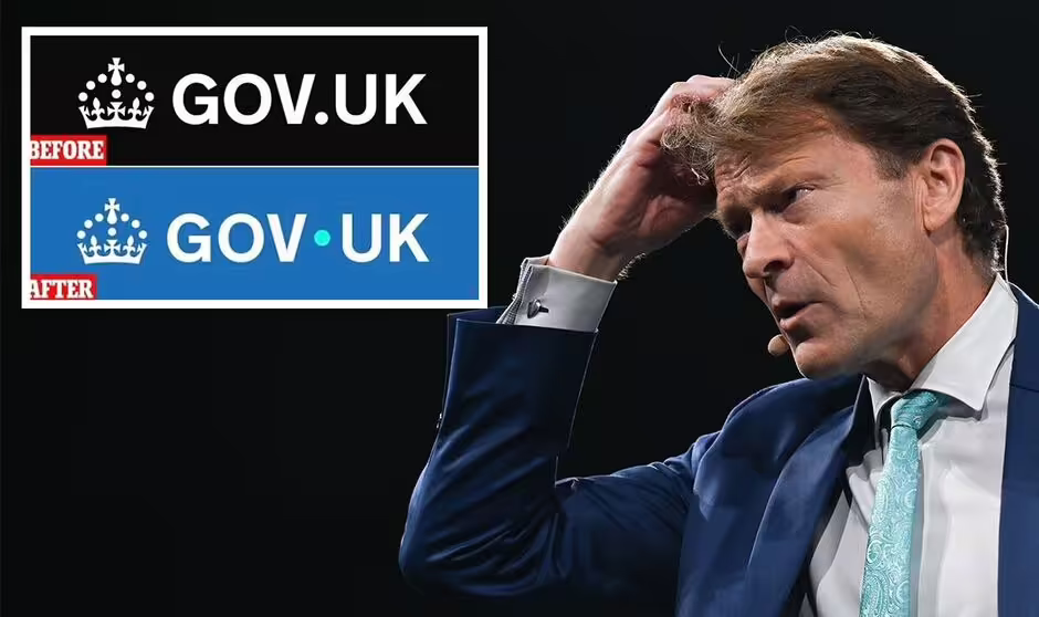
Rob Moore’s October 6 post, which has racked up over 40,000 likes and 2.5 million views, showed a side-by-side image of the old and new GOV.UK logos—a subtle shift where a black dot after “GOV” was repositioned slightly higher and recoloured turquoise. He commented: “£532,000 to rebrand this logo. That’s what the govt. spent. £532k to move a dot up and change one colour. The UK is falling apart, we are taxed to oblivion, and half a mil is wasted on this.

Reform UK’s Zia Yusuf (Image: Getty)
“This is FIFTEEN nurses salaries for an entire year for a job A.I could have done in 30 seconds for free. Your taxes are being squandered in front of your eyes. A disgrace.”
The figure was widely reported in June. Mr Tice, Reform UK Deputy Leader and MP for Boston and Skegness, fumed: “Seriously? £532,000 to change colour and move dot….. Taxpayers are sick of this waste.”
His post, shared with his 1.2 million followers, attracted more than 12,000 likes and 2,100 reposts within 24 hours, with the hashtag #MovingADot trending as a result.
Replies ranged from demands for ministerial resignations to defences highlighting the project’s broader scope, with one user noting: “This isn’t just a dot—it’s accessibility upgrades rolled out across thousands of pages.”
The controversy centres on a “refresh” of GOV.UK—the UK’s flagship government portal, handling over 50 million monthly visits—overseen by the Government Digital Service (GDS) within the Department for Science, Innovation and Technology (DSIT).
The changes, rolled out on June 23, 2025, included the logo adjustment alongside colour enhancements to headings for better visual appeal, improved contrast ratios for visually impaired users, and upgrades to screen-reader compatibility to meet evolving web accessibility standards.
According to GDS officials, the total £ cost, funded from existing departmental budgets, also covered technical implementation across thousands of pages, testing, and compliance work.
Backlash hit immediately upon launch, with civil servants anonymously criticising the design as “tacky” and opposition figures seizing on it as proof of Labour’s fiscal irresponsibility just weeks after taking power.
Also speaking in June, Reform UK’s Zia Yusuf, head of crisis response, said: “This sums up everything wrong with Labour’s approach. £532,000 could fund the salaries of 15 nurses for a year—yet here we are, polishing pixels while the NHS queues lengthen and families tighten belts.”
A Government spokesperson said: “As we made clear some months ago, this was committed to by the previous government with two of the three contracts signed and delivered by July 2024.
“This administration then chose to turn the rebranding and research work into consumer-friendly digital products, including our GOV.UK App, GOV.UK Chat and more.”